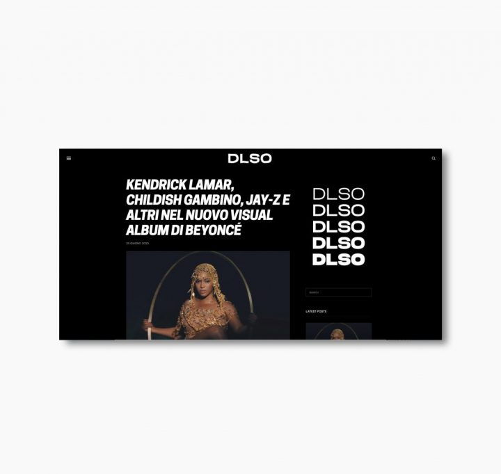
DLSO – Brand Identity
Client:
DLSO stands for Dance Like Shaquille O’Neal and refers to one of the greatest icons in basketball history. You would never expect someone like him to dance so effortlessly, yet his moves are unique, impressive, and probably better than yours.
Dance Like Shaquille O’Neal simply means: do things your own way, without imitating others, and success will be guaranteed.
This is a project that I curated for Coconut Studio.
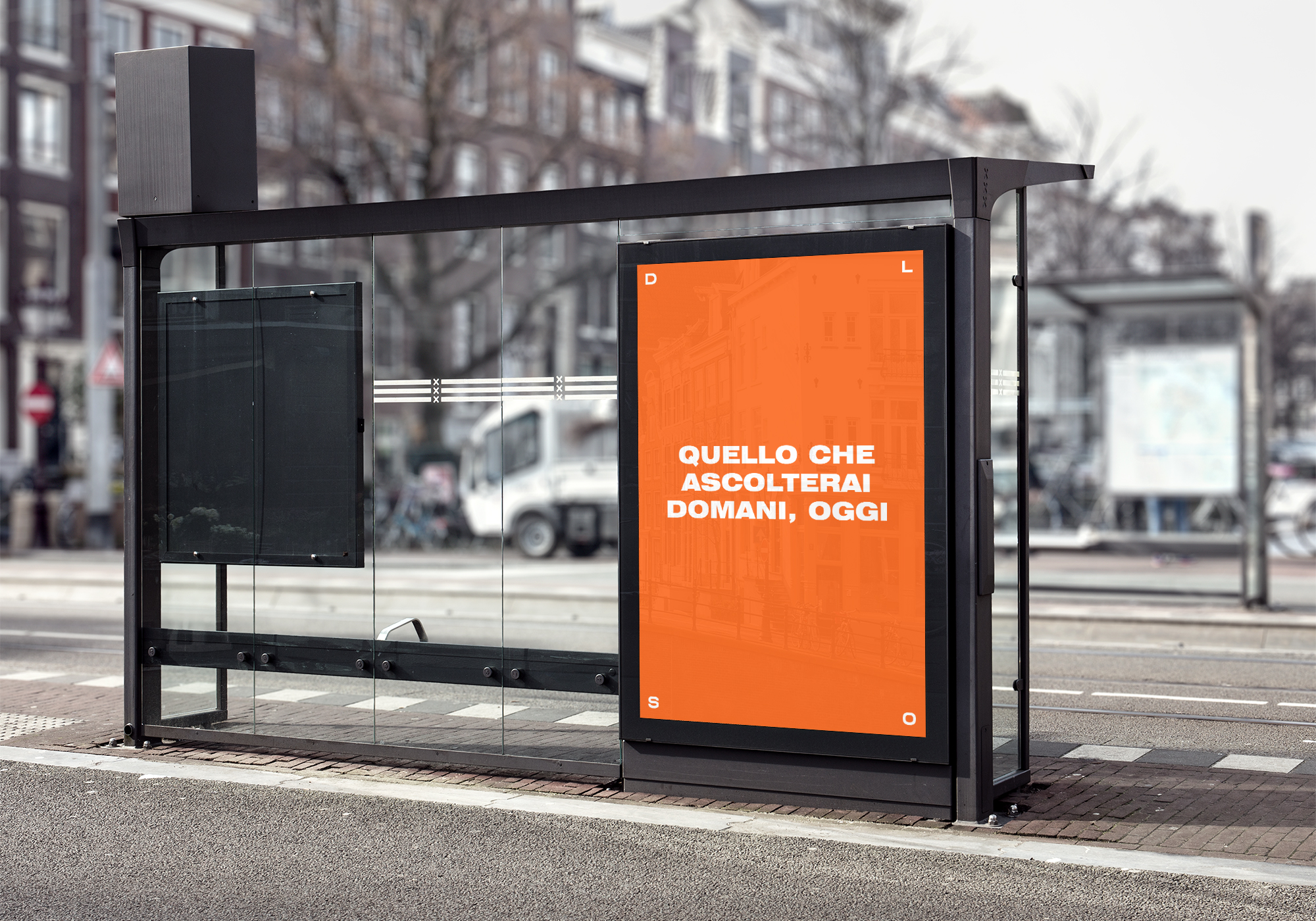
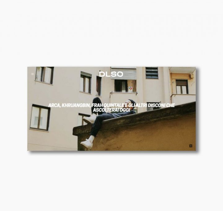
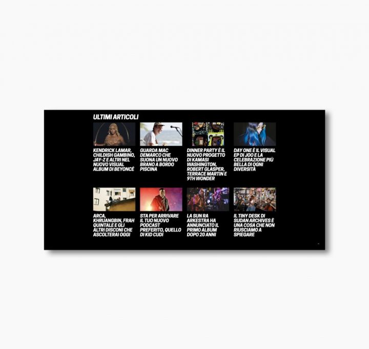
DLSO asked us to design a new logo, a new color palette, new Instagram layouts, and, most importantly, a brand-new website.
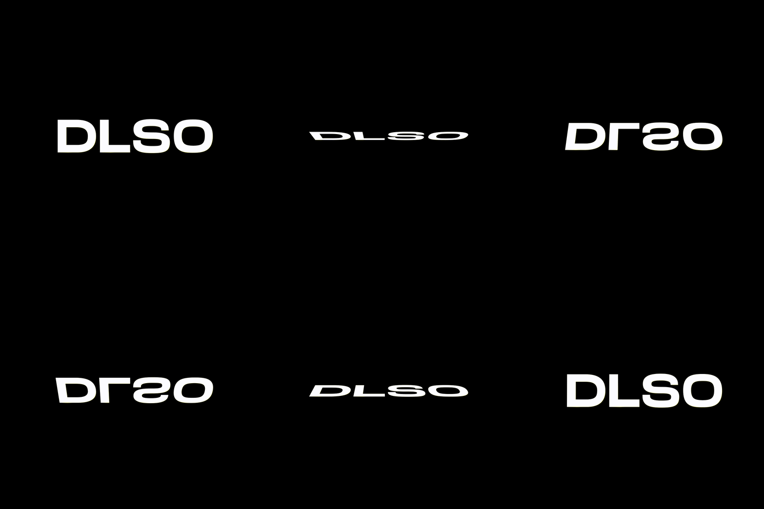
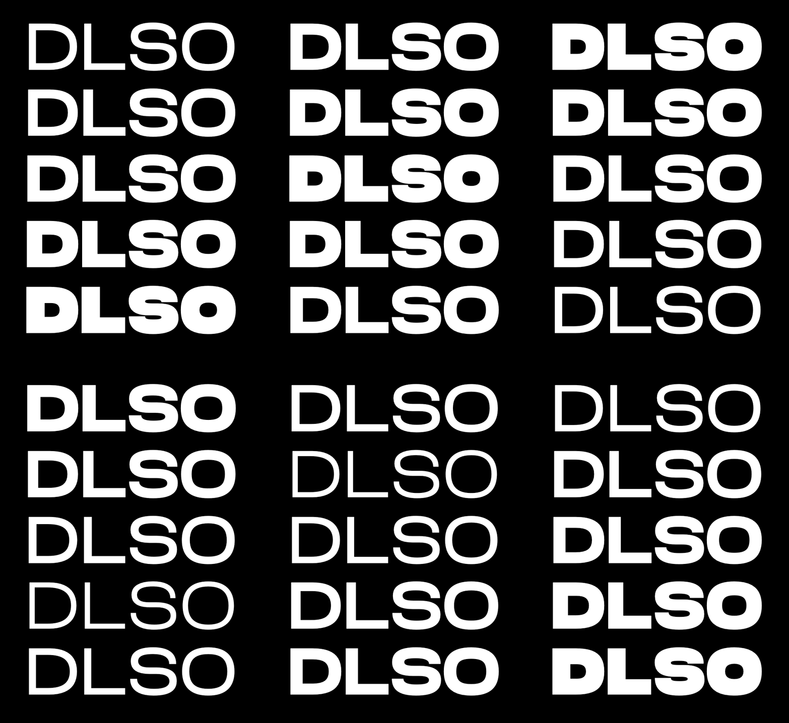
The logo restyling consists of designing a custom lettering. The movement once embodied by the single letter ‘L’ in the old logo has now been extended to the entire logo, bringing it to life through various animations.
DLSO now exists in both static and dynamic versions—fluid and adaptable to different needs—reflecting the dynamism of the music it showcases every day.
DLSO takes on a CMYK palette reinterpreted in an RGB key. We know it may sound unusual—and it is, to some extent—but the idea is to stay true to DLSO’s mission: expanding its readers’ horizons and anticipating trends. Cyan shifts towards green, the key color, becoming stronger and more vibrant, followed by magenta and yellow infused with red hues, while black replaces the white background.


The website restyling begins with the definition of a new color palette. Starting from the iconic green—already dominant in the previous website—we developed a personalized CMYK scheme with more vibrant and bold hues.
What hasn’t change at all is the desire to improve the experience of the readers and anticipate what you will listen tomorrow, today.
