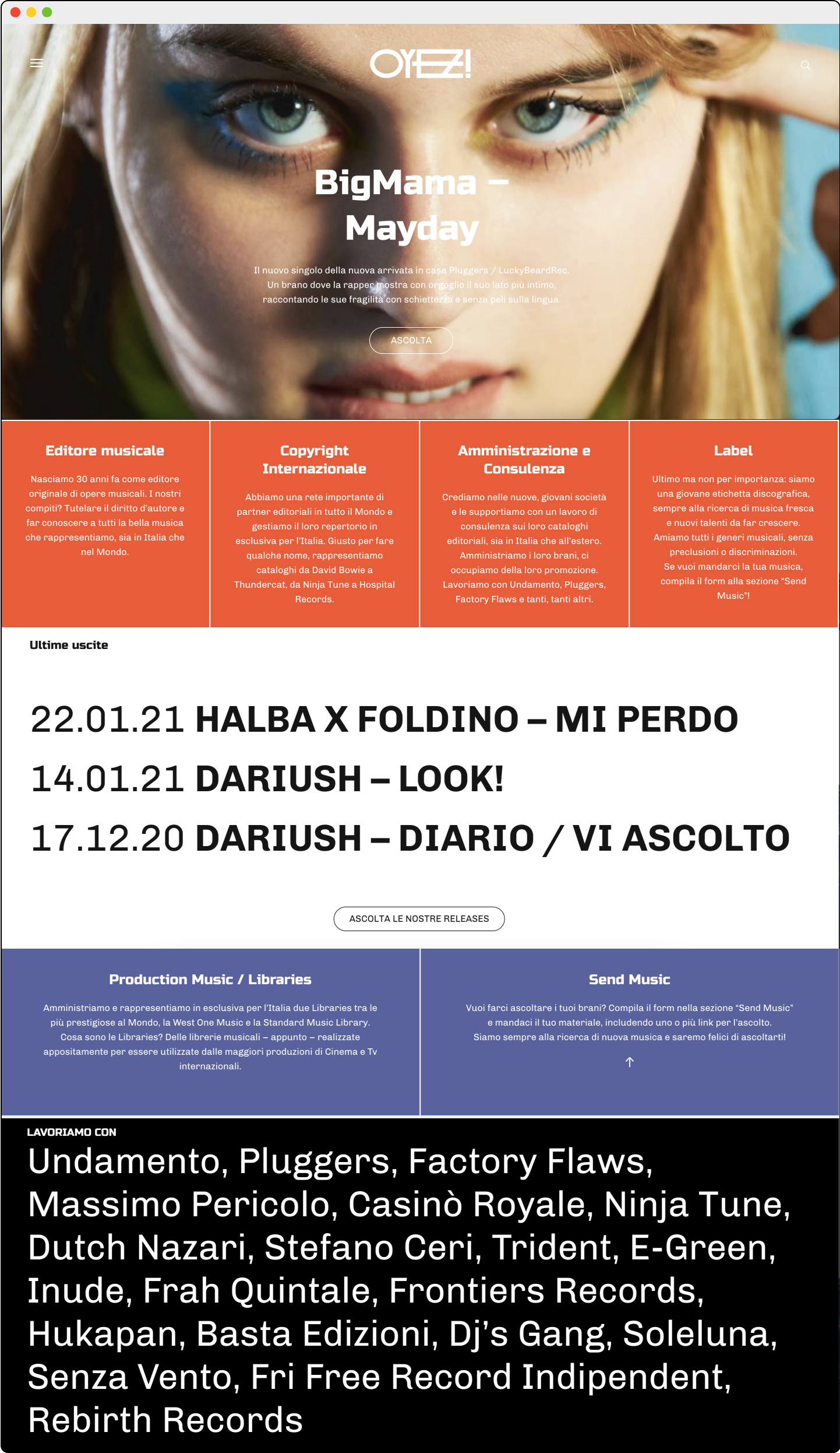
Oyez! – Brand Identity

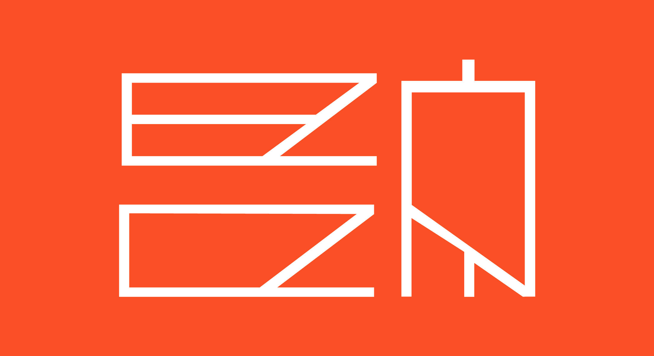
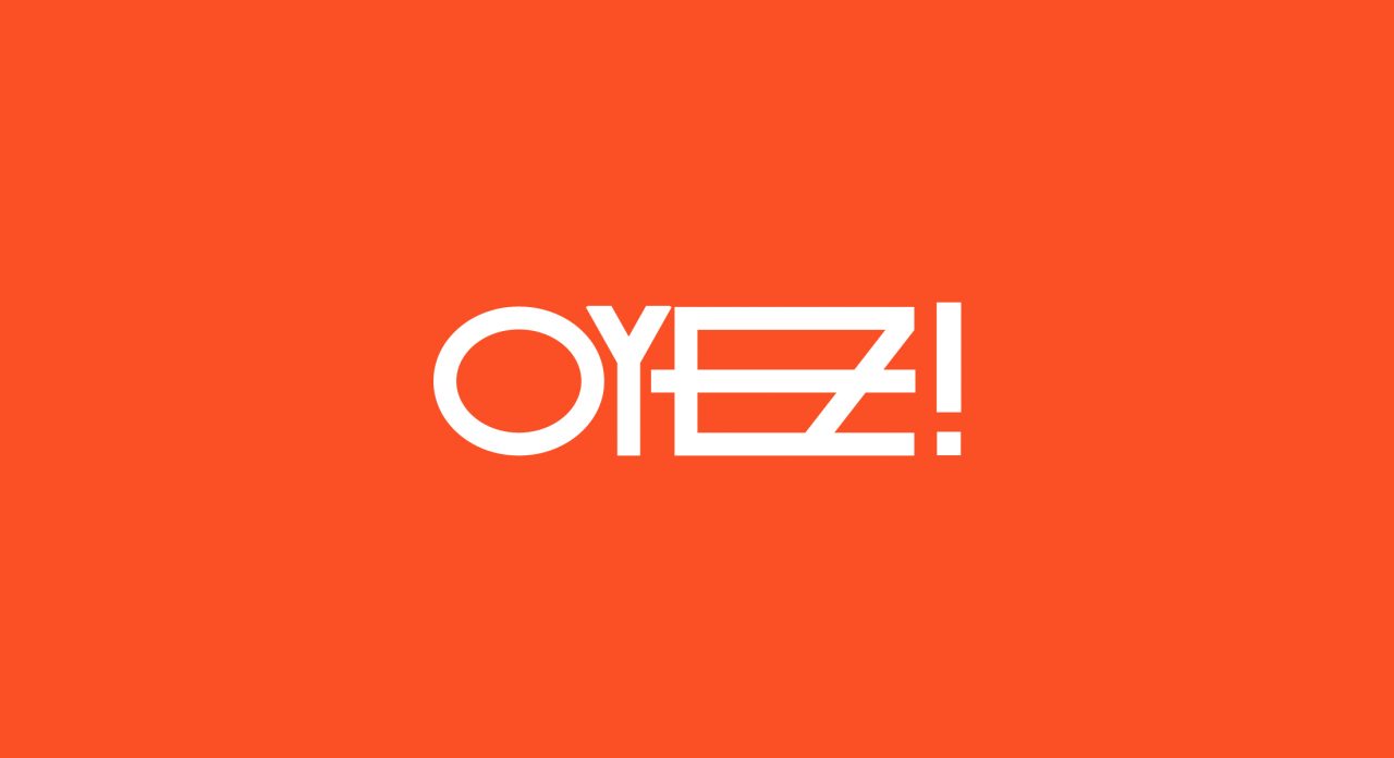
The main goal of this rebranding is to make Oyez! more attractive remaining faithful to its founding values. The primitive traits of the letters allude to the concept of tribe conceived as a team that works together to achieve a common goal. The concept of unity is expressed with a link between the last two letters visually united by a single line. Another characteristic that I wanted to be evident from the logo is dynamism. A team always on the move ready for change.
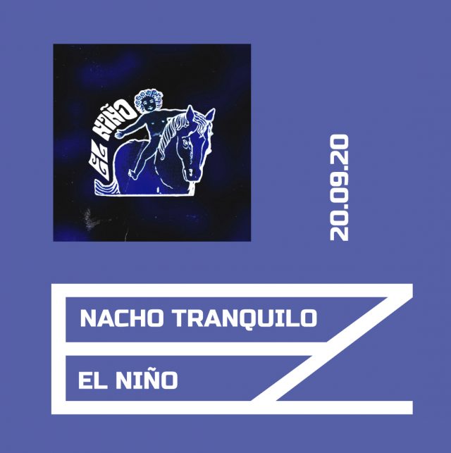
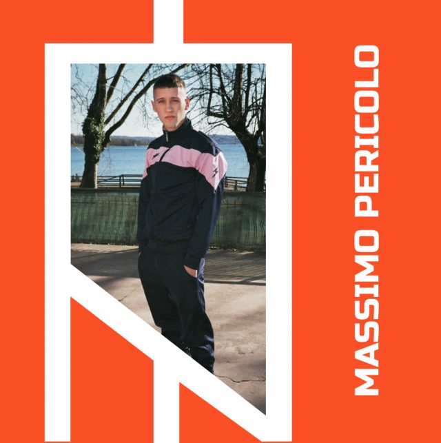
The characterizing element of the logo is used on social media in three different variations for as many types of posts. The combinations with the four corporate colors allow to create a colorful, coherent and identifying feed.
